
The last design principle we will learn is about how to add order and meaning to the elements of your design, without adding any more elements. Sounds subtle, but it effects everything you see, every day:
Alignment & Proximity
(If you’re just starting the UX Crash Course, Start Here.)

Today we say goodbye to the Old-Timey Rubber Ducks, but first they will demonstrate two of the most fundamental principles of visual perception. The ducks aren’t just pretty faces!
****
Alignment:
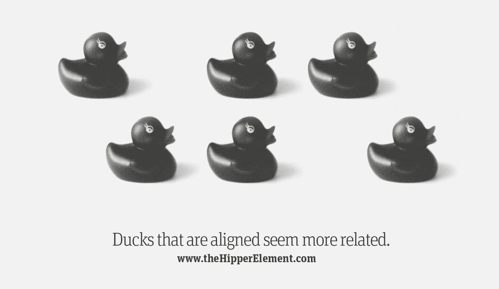
In the first image above we see a group of 6 stunningly handsome ducks, but we also see a lot of relationships, because of the way they are aligned:
We see two rows.
The far left and far right ducks seem to be “separated”.
The two center ducks seem the most “organized”.
All ducks seem to be going in the same direction.
If you see motion, the far left duck might be “falling behind”.
If you see motion, the far right duck might be “leading”.
Those 6 ducks are identical. Only the alignment creates these perceptions.
Buttons with similar functions can be aligned. Different levels of content can be aligned. Information can be in a grid of rows and columns like a spreadsheet to create complex meaning.
****
Proximity:
The closeness or distance between two objects creates a feeling of those objects being related or unrelated. That distance is called “proximity”.
In the second image you see 6 identical ducks which are not aligned horizontally or vertically, but we definitely see two groups. The ducks in each group seem “together” like a team or a family. The only thing creating that perception is their proximity.
In your designs, put related elements closer together and unrelated elements farther apart.
For example: a headline, a block of text, and a button that are all related to one action — like a purchase or an app download — are usually designed like a “package”. That allows the user to understand that they go together without reading anything.
****
Now that you are a design genius, tomorrow we will learn about the natural strong and weak spots in a layout: Z-Pattern, F-Pattern, and Visual Hierarchy.